Arya Homepage Design
Improving Conversion Through Strategic Design
Arya is a sexual wellness startup focused on improving and deepening intimacy and connection for couples. I was brought in to redesign the home / landing page experience for both mobile and desktop with the goal of increasing conversion.
My task was to rethink the layout, content hierarchy, and visual design to better communicate Arya’s value proposition and guide users toward sign-up. The result was a more intuitive, trust-building, and conversion-focused homepage tailored to the brand’s target audience.
Above the Fold
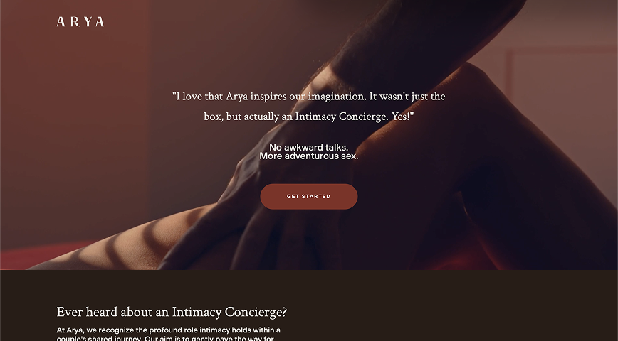
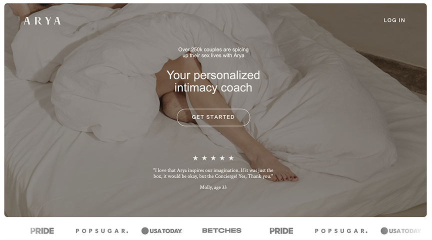
Looking exclusively at the content above the fold, when the user first lands on the homepage, we can see a stark difference.
In the original version (left), the user is drawn to a customer testimonial. Though it is certainly a positive quote, it doesn’t explain the product and could leave the site visitor with more questions than answers. Considering that this is a new product and does not have household name recognition, it’s imperative that we explain the value prop upfront. In my updated version, I introduce a clear H1 and H2 explaining exactly that while keeping the customer quote / social proof to build trust.
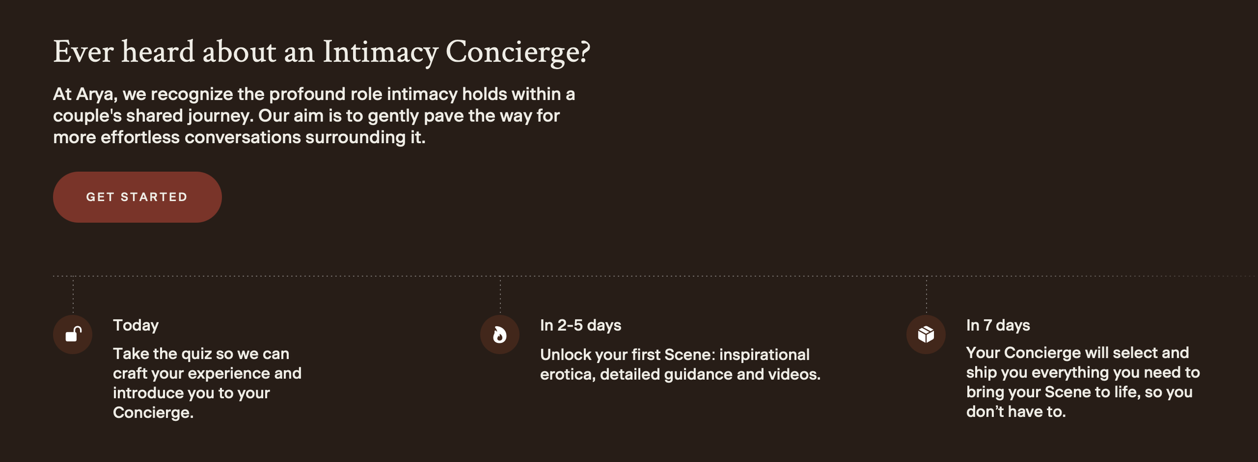
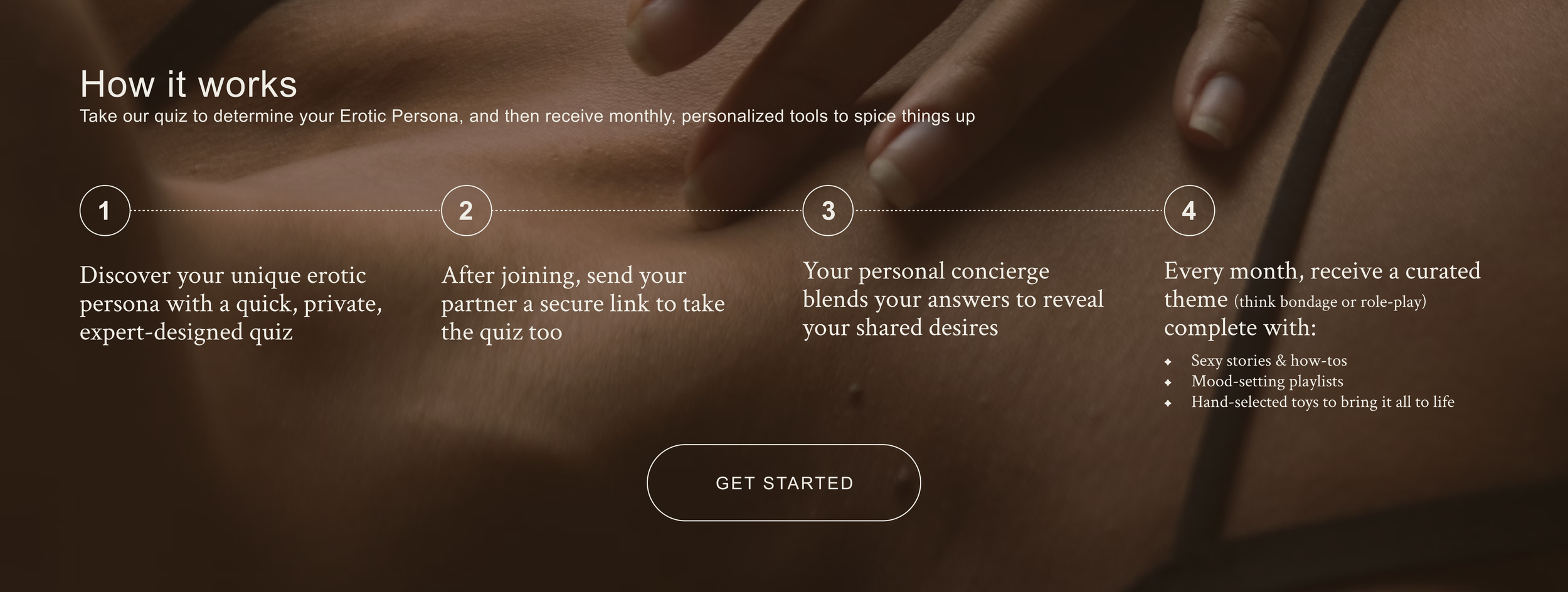
Content / How it Works